

For anyone who’s ever been driving behind me when I’m on my way to work, my apologies. I live in a beautiful place (northern Vermont) and some golden-hour light slanting across the landscape during my morning commute is always enough to make me want to stop in the middle of the road to grab a few reference photos. An i-phone photo taken with one hand on the wheel through a dirty windshield might not sound like the best place to start a good painting, but with the help of the photo editing tools that come with your phone, they can turn out to be just what you need. Here are some tips I’ve learned for getting what I need to make well-designed paintings from my older iPhone.
Five Tips For Taking Reference Photos
- Start With The Why The most important thing to remember is that you’re gathering information, not trying to make a work of art with your camera. Your shot doesn’t need to be a good composition, or even fully in focus. Instead, start with why you wanted to capture the reference photo, and work on collecting the data you’ll need to capture that “why” in paint.
- Take A Video Often when I look back at reference photos I’ve taken, I can’t remember what I saw in the scene that made me want to paint it. To combat this, I’ve started taking a short video clip along with a few still photos. In the clip, I record myself stating why I’m taking the reference photo and describe anything remarkable about the color and light.
- Don’t Zoom In Take photos that capture a larger area than what you think you’ll paint – that way you’ll have material if you decide to change the vertical/horizontal format or zoom out from your subject. However, if you were drawn to the composition of the scene, make a copy of the image and crop it the way you imagined painting it, so you don’t forget your plan.
- Take An Over-Exposed Shot Camera phones tend to merge dark areas together, over darkening shadows. Unlike our phones, we artists can render shadows as colors rather than darkness, so we want to gather data about what colors are in those shadow areas. If possible, I always take two photos of a scene I want to capture: one with the regular camera settings, and one with the light areas over-exposed so that color and detail in the shadows are visible. On an i-phone, you can change the exposure setting by clicking the six dots in the upper right corner of the camera app. If you only had time to take one photo, you can make a copy of it after the fact and then adjust the exposure until you can see detail in the shadows. Over-exposing a photo can also help you see where to leave unpainted white “sparkles” in your finished painting. Besides adjusting the exposure, the i-phone photo editor will also let you increase or decrease the brightness of shadow areas and highlight areas individually, and decrease the contrast over all. You can use these tools to help find those shadow colors, and to decrease the overall value range of the image, which I find can help me compose a better painting.
- Make Edits in the Field I almost always need to make adjustments to the saturation, vibrancy, and warmth of a photo in order to make it capture what drew me to the scene. The best time to make those adjustments is right after you take the photo, while you’re still looking at the landscape. If that’s not possible, I try to edit the photo as soon as I can after I get home.
Four Helpful Ways to Edit Your Photo
I like to make a few copies of the photo I’m working with, edit them different ways, and save them together in an album so I can reference them together easily.
- Crop the Photo On Your Phone Before you start to paint, try cropping your image in a few different formats. I like to do this on my phone, as the small size obscures detail and helps me focus on composing the big shapes. Sometimes I even set the phone on a shelf so I can stand back to look at it and obscure detail further.
- Make A Greyscale Version You can use the “filter” option in the i-phone photo editing app to make a copy of the image black and white. This can be useful for evaluating the composition and for understanding the value structure of the picture before you start to paint.
- Find Hidden Colors Many artists like to add small areas of vibrant color in their scenes, which provide a sense of movement and add interest. But what colors to add, and where? By increasing the saturation and vibrancy you can find “hidden” colors – a shadow may contain streaks of vibrant purple, a tree may have brilliant turquoise highlights – turn the saturation and vibrancy all the way up and see what happens! If your aim is realism, you may not want to paint the entire painting at that level of saturation, but you can borrow those bits of color and they’ll likely work as part of the whole. Make a copy of the image so you’ll have a super-saturated and a more realistic version to look at.
- Make the Photo Match Your Palette Playing with the “warmth” and “tint” settings are a good way to try out different color palettes for the image. For instance, if I’m painting a warm sunset scene, I can imagine wanting to use lots of quinacridone rose and gold. I can move the tint and warmth adjustments until areas of the scene highlight those pigment colors. This can make it easier to paint with a limited and more cohesive palette.
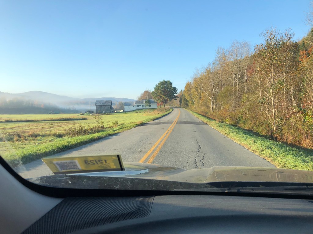
I started with a photo quickly taken through the windshield. In an ideal world, I would have taken at least two shots, one with higher exposure – but the world is rarely ideal!
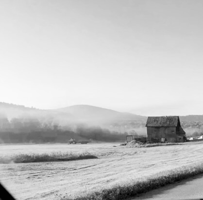
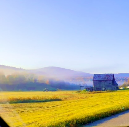
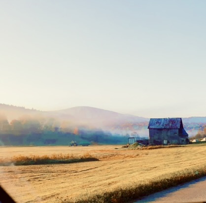
Later on, back at the ranch, I tried out several different crops using a grey scale version of the photo to make sure the value structure works, finally settling on a square format. Next, I up the saturation and vibrancy. Then I try out a few filters to see what the image looks like with different color palettes, before deciding to go with something close to the original photo.
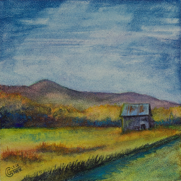
For the final 4×4″ painting, I altered the composition slightly to remove the tangential alignment of the barn roof and mountain and make the mountain peak more defined. Clouds add interest to the upper portion of the painting. The colors are realistic, but borrow from the super-saturated version when defining shadow colors.
What are your tips for taking excellent reference photos? Share in the comments – and don’t forget to subscribe if you’d like articles like this delivered to your inbox every Sunday!

Carrie- I’m loving your blog here! And a whole course could be taught on using the iPhone for reference photos. Everything you say about using the full range of the adjustment tool on an iPhone can be used to help the artist see a variety of other possibilities. Personally I like the adjustment of vibrancy better than saturation, as it doesn’t alter the original as much, and isn’t as garish, yet accentuates some of the more salient details. Also I agree to take a very wide shot of the whole scene that grabs your attention. You may be able to get 2-3 or more paintings out of that one shot. I’ve had the opportunity to use one good photo for a series of paintings, that is always fun and a good learning experience for me. Thanks again for informing us with your in depth information! I look forward to it every Sunday! Anni
LikeLike
Thanks, Anni! Glad you enjoy it.
The thing I like about upping saturation is that it helps me find hidden colors in the shadows. I may not paint the whole painting based on a super-saturated reference, but having seen it, I have good information to use for a more realisticly colored painting.
Adjusting vibrancy is especially fun for clouds, I think. There’s often a whole painting hidden in the sky.
LikeLike