

As we learned in my posts the last two weeks (Are My Paints Poison? and Are My Paints Poison? (Part II), cadmium and cobalt-based pigments are just some of many possible toxic ingredients that can be found in paint; and because the metals are chemically bound to inert substances they are mostly not absorbable by your body. That said, cobalt and especially cadmium are not good for you, and airborne absorption is an issue (from breathing dried paint dust). Cadmium and cobalt mining are also terrible for the environment and have a record of human rights abuses, leading some to refer to “blood cobalt.” On a practical level, these metals are in short supply as they’re used to make batteries and modern electronic equipment, causing prices for cobalt and cadmium paint to continue to go up, with no end in sight. All of these are good reasons to look for replacements for the cadmium and cobalt paints on our palettes. I did some research and a bit of testing and found some substitutes I found acceptable – and others colors which might be irreplaceable.
Let’s start with cadmium.
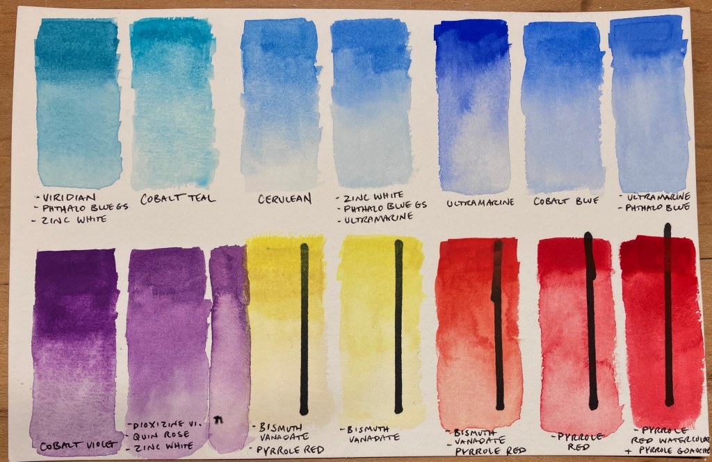
Cadmium colors range from a light lemon yellow, through orange and all the way to vibrant fire-engine red. They’re highly opaque, heavy colors that pack a punch and are exceptionally light fast. So for any replacement opacity and lightfastness are the qualities we need to match. Several paint manufacturers are already selling “cadmium-free cadmium” colors, which aim to match these qualifiers. I’ve been using the Utrecht version, which I’ve been pleased with (although I’ve had bad luck with other Utrecht paints, which separated badly). Winsor and Newton also have a “cadmium-free” line. The Utrecht paints are Bismuth Vanadate Yellow (PY184) mixed with Pyrrole Red (PR254), or Pyrrole Orange (PO73). Winsor and Newton says their paint recipes are “proprietary,” but it seems likely that the ingredients are the same or similar.
How does the replacement measure up?
This is one instance where the replacement may really be just as good as the original, though (full disclosure) I got rid of my cadmium paints a long time ago, so I was comparing my tests against previous experience and reading other’s reviews. Bismuth Vanadate and the Pyrrole colors are exceptionally light fast, and Bismuth Vanadate is also very opaque, with a similar heavy quality to cadmium. In many commercial applications, it is already being used to replace that pigment. Pyrrole Red and Orange are generally manufactured to be quite transparent for watercolor use, but it can be prepared differently in order to make a more opaque pigment. If you’re curious about the history of these two pigments (both invented since 1970) this article has a wealth of info.
If you are, like me, the sort of person who would rather buy cocoa powder and flour than a cake mix; you can easily make your own cadmium-free “cadmium” mixtures with a tube of Bismuth Vanadate Yellow and a tube of Pyrrole Red. Many of us have these colors in our collections already! To get the same opacity as a real cadmium red, you might want to use a Pyrrole Red or Orange gouache, however, which is made to be opaque. Unfortunately, Bismuth Vanadate tends to be a pricier pigment also, but these mixtures will still cost less than cadmium paints.
Now for cobalt.
This was much more challenging. Cobalt-based pigments come in a very wide range of hues: cobalt blue, teal, purple, and green; as well as cerulean blue and aureolin yellow. What these pigments have in common is that they’re highly granulating, with dilute washes creating beautiful texture as the heavy pigment particles settle unevenly into the low spots of the paper. These large particles are also easy to lift, and non-staining. In concentrated mixtures, they are opaque and the value is always on the light side compared to similarly-hued organic pigments. They’re also very light fast. (If you want a refresher on organic vs. inorganic pigments, check out my earlier post here.)
The actual hues of these pigments are easy to match with reasonably light fast, synthetic organic alternatives like Phthalo Blue and Dioxazine Violet, however these highly-concentrated pigments must be diluted with a great deal of water to get the same value as a cobalt paint, at which point they don’t handle the same. For this reason, the many cobalt “hue” colors which are commercially available are usually made with an organic pigment plus white (usually Titanium White).
The other problem with synthetic organics is that they are highly staining and non-granulating. When mixed with Titanium White, the result is a flat, somewhat chalky version of the same hue as the cobalt original. Not a one-to-one replacement. Based on my previous research on granulating mixtures, I set out to find other pigments to add granulation to these mixes. The commonality between any cobalt-replacement mixture is the need to add white, so I decided to start there. It turns out Zinc White (PW4) is more granulating and has a more transparent, less chalky look than Titanium White (PW6), so I used that for all my mixtures.
Cobalt Blue is very similar in hue to Ultramarine Blue, which uses heavy clay as a key component and consequently has granulating, lifting, and opacity qualities similar to a cobalt. Adding a tiny amount to Phthalo Blue made my Ultramarine Blue into an exact hue match. Winsor and Newton and Davinci sell an Ultramarine Green Shade, which looks like it would be a good match right out of the tube.
For my Cobalt Teal replacement, I made a mixture of Viridian, Phthalo Blue Green Shade, and Zinc White. The heavy Viridian created a granular quality that made this a fairly satisfactory replacement. Though genuine Viridian is made from chromium, it is generally considered non-toxic – if on the expensive side.
I used Purpurite Genuine pigment from Daniel Smith’s Primatek line in a similar way to cause granulation in my “Cobalt Violet” mixture. The final concoction was Dioxyzine Violet, Purpurite Genuine, Zinc White, and a touch of Quinacridone Rose. Because Purpurite is a dull, grey purple, I couldn’t add enough to get the granulation I was seeking without totally desaturating the mixture; so I’d rate this one just “usable.” For lower-chroma uses, just substituting Purpurite could be a good solution.
My least successful substitute was for Cerulean, which is too bad because that’s the one cobalt pigment I can’t imagine doing without. As a landscape painter in the Northeastern US, Cerulean is the exact right color for a sunny-day sky here, right out of the pan. Because it’s so easy to lift, building realistic clouds is much easier than with Phthalo Blue, though Phthalo has a similar hue. To try to get some granulation and replicate Cerulean handling properties, I mixed Phthalo Blue Green Shade with Zinc White and a little Ultramarine, but the result was still too flat, and worse, very staining. Some online research yielded a possible alternative: Zirconium Blue. This pigment is available from a few smaller, hand-made watercolor companies, such as A. Gallo and Kremer. It’s not cheap, but based on the comparison tests I saw, it looks like a one-one substitute for Cerulean (or close to it), and could be used to make Cobalt Teal substitutes also. Zirconium is non-toxic and found in many locations all over the world, so perhaps this pigment will become more readily available as cobalt becomes more expensive. I’m planning to get some once my current tube of Cerulean runs out.
And that’s the extent of my testing! Hopefully this info helps you make better-informed choices about whether you should continue buying cobalt and cadmium pigments.
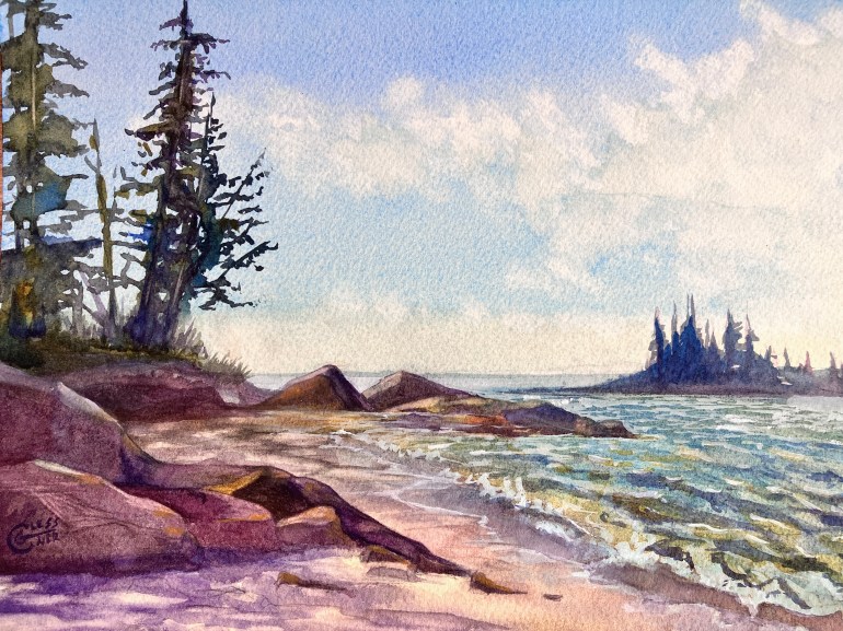
Hard to imagine making this painting without Cerulean Blue!
