
There’s a lot that I love about the pigment Prussian Blue (PB27). Although many people use the more modern, cleaner, Phthalo Blue on their palettes instead; I like how Prussian Blue is slightly warmer and slightly grayer, making it more natural and a better match for skies and lakes right out of the tube. It’s also slightly less potent than Phthalo Blue, which easily overpowers other pigments in mixes. I’ve been wondering if it would be a better choice for the student palettes I put together for classes, since new watercolorists often struggle to manage potent, artificial-looking Phthalo Blue. Thus far though, I’ve held back from using Prussian Blue because it has a bit of a dubious reputation. It fades? It darkens? It reacts? I feel like I’ve heard all those things! Obviously, it’s time to do some research. What exactly are the concerns about Prussian Blue? And are they warranted?
The Origin Story
The first thing to know about Prussian Blue is that it has a long history and an interesting origin story. It’s actually the very first modern synthetic organic pigment, and its creation ushered in the current era of bounteous synthetic color. There are several accounts of its original accidental creation in 1704, but the most interesting one is this (as quoted from Jackson’s Art):
“A pigment maker in Berlin named Diesbach was making a batch of a Red Lake pigment using potash, crushed cochineal insects, and iron sulfate. Having run out of potash, he went to local pharmacist Johann Konrad Dippel to purchase some more. Dippel, possibly looking to fleece Diesbach, sold him potash that was contaminated with dried cattle blood. When Diesbach tried to make his red pigment, it made a deep blue pigment instead. Dippel knew that it was his adulterated potash that had caused this reaction and saw a business opportunity, so they conducted further experiments and commercialised the colour under the name Berlin Blue.”
Eventually, the recipe for the pigment was deduced by a rival English chemist who published the information. As the first synthetic blue pigment to be invented in the West since the time of ancient Egypt (Maya Blue, a sort of synthetic/natural hybrid, had been around in Central America for ages but was unknown in Europe), Prussian Blue was a big deal. Prussian Blue quickly became a popular choice for all sorts of applications, and remained so – the next synthetic blue pigments, Cobalt and Ultramarine, wouldn’t be discovered for over a hundred years. Prussian Blue is used for classic Japanese woodblock prints, the “blue” in blue prints, the “cyan” in cyanotypes, ball-point pen ink, and laundry bluing. It’s also used in medicine to treat heavy metal poisoning.
Dippel, however, could no longer cash-in on the discovery. In an attempt to raise cash (continues the article from Jackson’s Art), “he claimed he had discovered an elixir of life and tried to buy a castle in exchange for it (an offer that was rejected). Rumors spread accusing him of grave-robbing, experimenting with cadavers, and being in league with the devil. Some even theorize that he inspired Mary Shelley’s Frankenstein.” Dubious indeed!
The Chemistry
Prussian Blue is an iron-based pigment. For the first hundred years of Prussian Blue production, it continued to be made using dried cattle blood as an iron source. In the early 1800s, a process using coke, potash, and metallic iron began to be used instead. Even so, the chemistry was often inexact, with many contaminants present, leading to much variation in the resulting pigment. This is important because it means that historic concerns of fading and browning may be no longer relevant.
So – does it fade? Historically, the answer is certainly yes. The impermanence or Prussian Blue was noted almost as soon as it was invented. It’s also seen to fade more when mixed with white (increasing the amount of light reflecting onto each pigment particle of blue) and when the particle size is smaller. Today, with standardized ingredients and pigment grinding, Prussian Blue is generally rated as ASTM I (excellent). However, artist’s at-home light fastness tests show that fading is still an issue for most brands (and sometimes there’s even variation within brands!) Interestingly, Prussian Blue seems to fade quickly during the first few days or weeks it is exposed to the sun. After this initial fading it remains stable.
Weirdly, the National Gallery of London (and other reliable sources) report that the color will darken, or “recover,” if stored in a dark place with good air flow. This is because the color of Prussian Blue is created by oxidation, the exposure of the compound to oxygen changing the form of the iron in the pigment. Exposure to sunlight reverses this process, causing fading. In the dark, the pigment oxidizes again and regains its color. This is the same property utilized by cyanotypes and blueprints.
And what about its reactivity? You may have heard, as I had, that Prussian Blue shouldn’t be used with certain other pigments. This is because it is supposedly sensitive to alkaline (or basic) substances, which cause a chemical reaction that makes it turn brown – while releasing (very small amounts of) cyanide gas. Although gum arabic, the medium or “glue” for most watercolors, is slightly acidic; and watercolor manufacturers aim for something close to neutral acid levels in their paints; there are many basic substances in the watercolor environment. Paper (including Arches) can be “buffered” with the inclusion of basic materials to prevent yellowing from acidic air pollution. Masking Fluid often has ammonia, a weak base, as a main ingredient. Watercolor grounds are acrylic gesso-based, and acrylic is slightly basic. Tap water is naturally basic in many parts of the world and in homes with water softeners. Are these weak-ish sources of alkalinity enough to make a difference?
The Testing
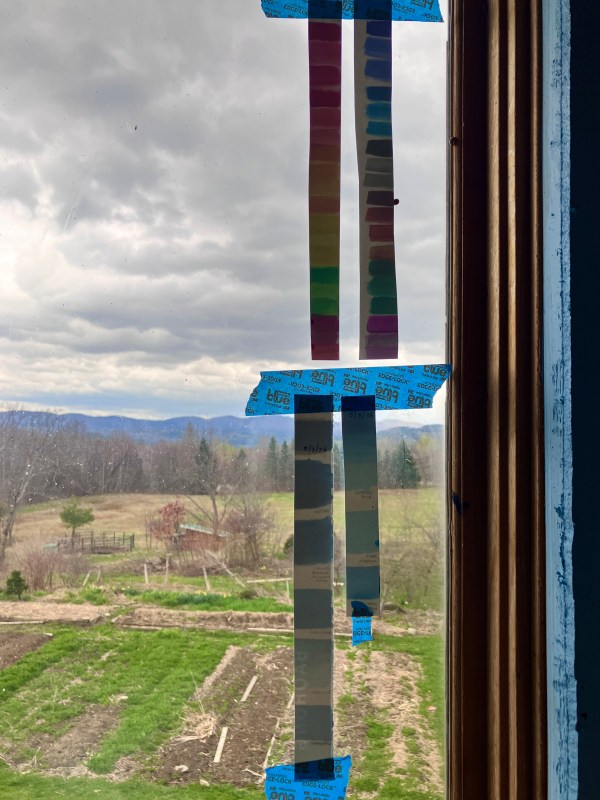
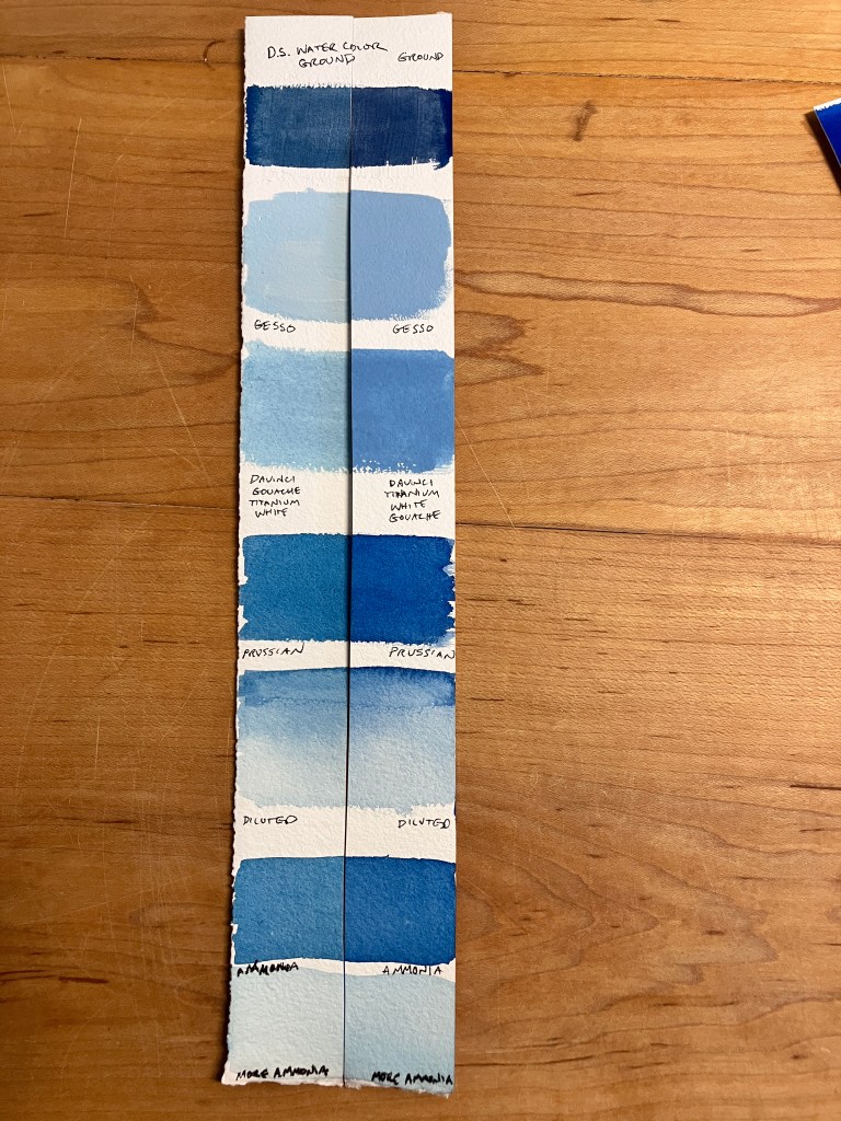
After my research, it seems clear that the only way to know what your specific tube of Prussian Blue will do is to test it. So I got down to business. I painted swatches of Daniel Smith Prussian Blue on Baohong Master’s Choice paper (which is buffered) using my slightly acidic (hard) tap water. I Painted samples mixed with Titanium White gouache and diluted with water to test fading; and mixed with acrylic gesso, painted on Daniel Smith Watercolor Ground, and mixed with ammonia, to test discoloring due to alkalinity. I also painted swatches of Phthalo Blue for comparison. Interestingly, even the swatches mixed with large amounts of ammonia showed no immediate color changes. Next, I cut each swatch in half and hung one half in a south-facing window that gets full sun and put the other half in a dark drawer.
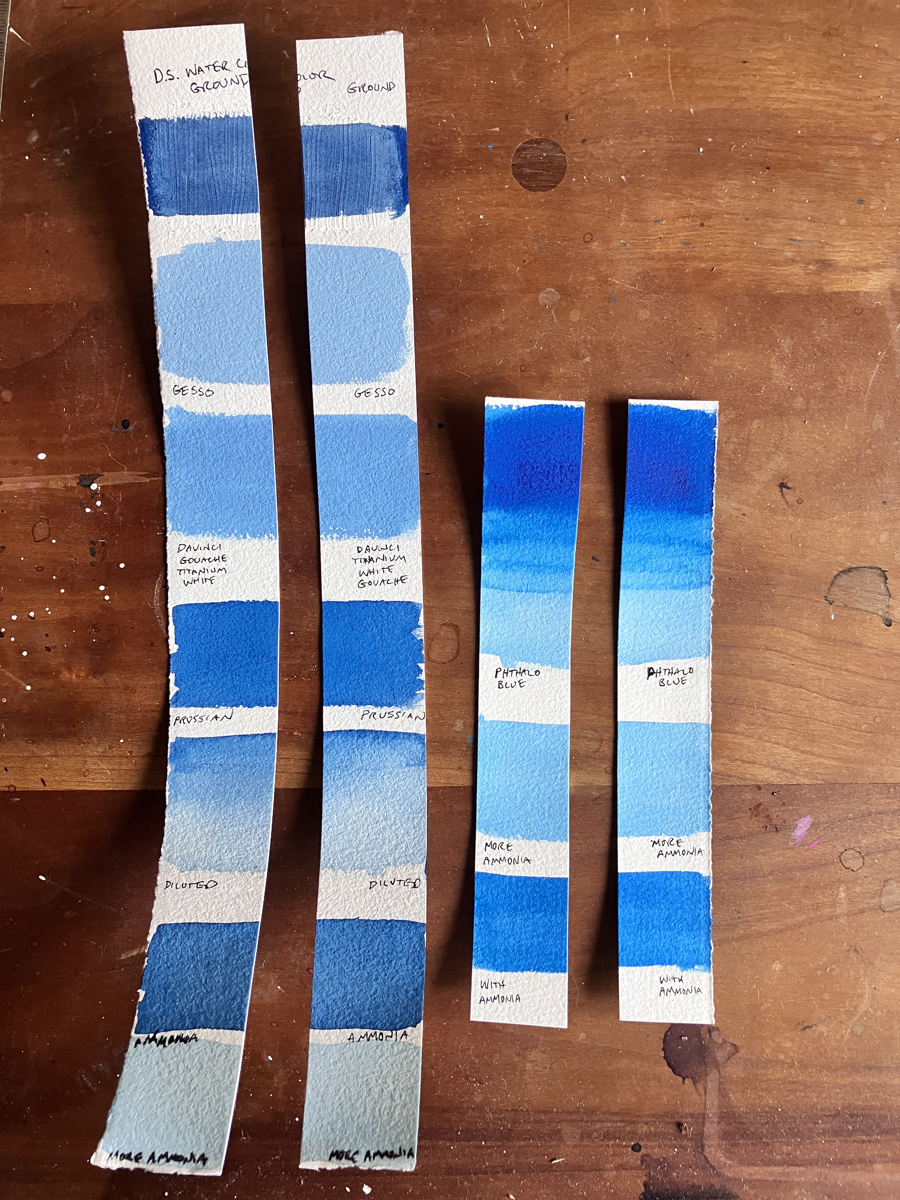
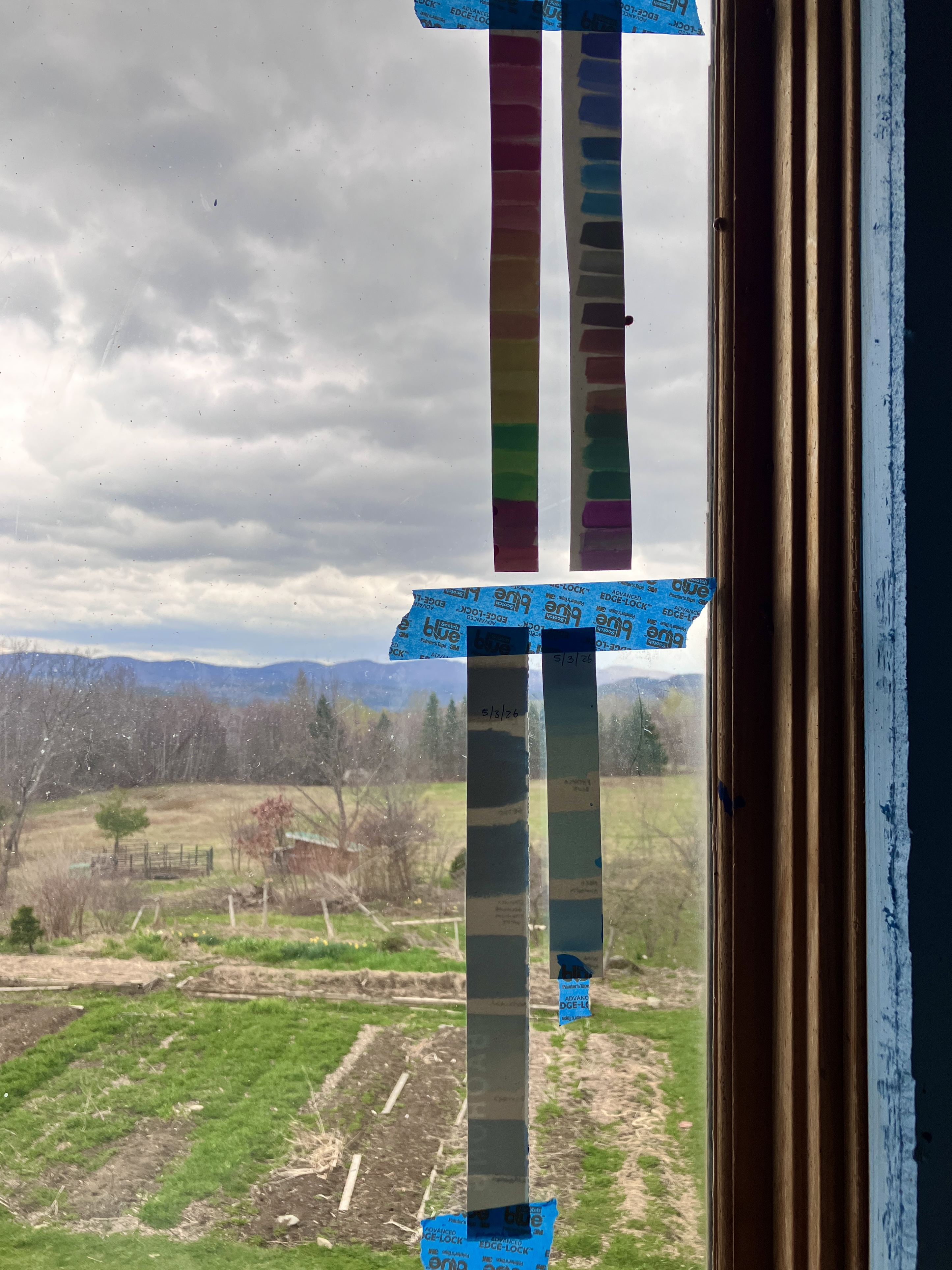
The Results
After only five days (three of which were very cloudy), all of the Prussian Blue samples which were hung in the window are very noticeably faded (the samples on the left in the photo). Honestly, I’m a little shocked at how faded they are – I don’t think I’ve seen paint fade so dramatically before. The samples mixed with basic products faded equally to the other samples, and showed no sign of any browning. The Phthalo Blue samples did not fade or discolor at all.
Next, I plan to place all the samples in a dark drawer to see if the Prussian Blue recovers, and if browning occurs after more time has gone by. However, seeing how quickly and dramatically the Prussian Blue faded, it’s clear to me that this isn’t a pigment suited for permanent work, or even work that you forget and leave lying on your desk in the sunshine. I don’t think my art should come with disclaimers about needing to “restore” it in a dark place after a week of viewing. By contrast, browning due to alkalinity seems like a minor concern.
An Alternative?
Looking at pigment sample comparisons, DaVinci Indanthrene Blue leans towards green (unlike most brands which are warmer) and is very similar, but slightly warmer, than Prussian Blue. Indanthrene is a reliable pigment, and like Prussian Blue, it mixes strong darks. The DaVinci Indanthrene may be a better cool-blue, less-artificial alternative to Phthalo Blue.
What experiences have you had with Prussian Blue? I’d love to hear about them in the chat! And if you haven’t already, subscribe to the blog to get posts delivered right to your email!